Test shots taken by Me
Experiment
Looking through the secondary research, I found many photos use the sepia effect to create a lonely and abandoned atmosphere whilst presenting the decay of a place. I wanted to try it out on one of my photos, and I chose the one of a church entrance on a bright day. Here is a step by step method that I used to manipulate my image using Adobe Photoshop elements 9.
Clicking on the screenshots will allow an easier viewing
Firstly, I place the image in photoshop and snap up the contrast slightly. This would display detail more stronger, and also strengthen the colours and shading. I knew this would help display details when using the sepia filter.
Here I add the sepia effect, called 'vintage photo' in photoshop.
Here is the photo after adding the effect. It is starting to gain more contrast in areas, although it still looks fairly bright and doesn't give a lonely and depreciated atmosphere found in the secondary research.
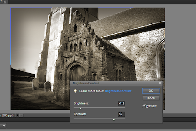
Here I select the areas which I want to shade the photo around the edges, by firstly raising the feather to 200px, this makes the areas I select fade into darkness, and will avoid adding areas that all of a sudden turn dark. Next I make a selection box covering centeral areas of the image, but leaving a reasonable area around the edge, which I want to shade. To select the area around the edge, I went under the select tab, and clicked 'select inverse'. After selecting where I wanted to shade, next I do this by adjusting the lighting which the image shows above how I got to it.
Here I adjust the lighting, highly bringing down the brightness. You can really see the edges starting to darken and generating a more 'spooky' and lonely atmosphere removing the previous bright feeling. I have also raised the contrast again, which darkens the colours in this situation adding more shading.
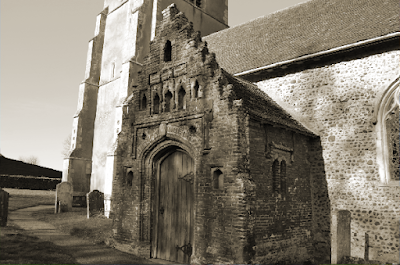
The final outcome after manipulation. I am quite happy with the result, it makes a fairly similar impression of the techniques other photos use to present decaying places and objects, and generates a fairly lonely and derelict atmosphere which really I feel is an interesting and strong way of presenting decay. After experimenting with this I would happily use the same technique on a different photo, possibly for my final project.
Here are a few photos I took of an old church enterance. I think it is a good subject showing it's age, from natural forces such as weathering causing decay over time. There's also some fine details which I was happy with.
This is a photo of an old church entrance, which has over the past started to show long-term decay, and with repairs possibly here and there. What I like about this photo is the detail and colouring, the main subject a lot of textures and different details, whilst the background doesn't blend in with this, with another aspect being that the subject is a dark red colour, which separates it from the brighter surroundings. Something else I liked was the bright atmosphere, with blue skys. The sun brings soft shading around the photo, and adding contrast bringing out the detail. The strong blue sky also matches well.
Closer to the front of the subject, I wanted to present the detail from a closer point of view. I like all the patterns and textures, built up around a distinctive dark red colour. The sunlight also creates some contrast, but what I was happy with is that the lighting is not too harsh, and shadows created by nearby trees have created shaded areas softening the light.
This photo is taken at the same angle as the first one, but slightly closer. I slightly prefer this photo, as I think the details are captured my sharply, and in the first photo the tower appears to me as a slight distraction being sloped to one side. There is also a large chunk of blue sky and a small path leading off round the edge of the church to the bottom left corner which I really like the effect of.
Test - shots
This was another test photo shoot of several rusting objects around the garden. I aimed to capture some everyday rusting objects from an interesting point of view. For these photos I used a tripod because this would keep the camera completely still allowing tack-sharp focusing, great for extreme textures and very high details as these can be captured sharply.
I was really happy with the amount of detail this one object had, supporting it's decay.
There's cracks, patterns, rust, paint wearing off, creating some great textures. This image itself
shows quite a lot of detail of the object and most of what is to it.
Here the composition of the photo is quite different, there is several
leading lines and it is taken at an angle where the patterns on the bottom
half of the image are symmetrical making an interesting concept. I used macro mode to
capture the fine texture and detail of the particular corner.
A head on shot of the object, since it is further away from the camera
it picks less up on the individual details, and focuses on the object as a whole. There's also
several background distractions.
A slightly diagonal shot of the object, similar to the one above. I slightly prefer
this angle as the object seems more 'level' and neatly positioned rather than the one above. There's
also slightly better colour and detail.
This was a different object in the garden, which had some interesting textures of rust
across it. This shot shows quite a bit of detail and the background works fairly well,
not too much of a distraction, plus it's dark colour creates some contrast making the
object stand out better.
I was happy with this shot, it presents the details well, whilst having a blurred background. This shot highly benefitted from being taken with a tripod, as the textures are really sharp. The angle that has the object to the right of the image also positions it well, making it slightly more different to if the part of the object displayed here, was just in the centre which would be more boring and average.
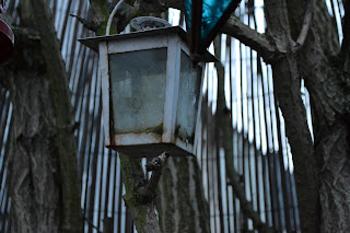
This was a hanging lantern slowly showing signs of decay. The detail and position of this image
isn't too bad, but at this time of the day it was getting slightly darker and the image appeared slightly too dark.
Another view of the object, this time with another lantern close to the camera and out
of focus. An alright view of the white lantern but the blue one becomes as quite
a distraction of the image as it's not obvious what it is, and being out of focus.
I liked the concept of this image, with wood framing around the lantern, and heading away. There's also some plants to add to the effect. There is some good detail of rust on the subject which supports the main idea. A little too dark from the time of day and not having a tripod which would enable me to have used a slow shutter speed and brighten the image.
An interesting concept of a metal sunflower ornament rusting away. Not as focused
as i'd wanted, there details are blurred.
Slightly more focused, presenting the details and contrasts better. There is a lot
of background distraction which is unwanted, since the shot is further away from the subject the background is slightly more in focus and more can be seen.
A few more images on some machinery. This shows shows some interesting
detail, especially with the chain running down the centre. The colours are slightly grey there's
not much to look at, like no standing out objects or textures...
Same sort of idea as above, not anything to focus on, there's not really any interesting
object to focus on, although theres some slight texture in the centre.
Secondary Research
This is an image of decaying machinery, which I think is an inspiring idea for the project. I like the textures and high detail of all the once-working components - this really sets you back to when it was working. I hope to capture something similar to this, where decay is happening through metal and larger objects.
In this image of a decaying car, this really catches your attention with it's long abandonment, where nature is highly starting to take over it. Something this image indicates is how nature judges how long an object has been isolated, in this case theres lots of plants growing up the car showing it's been there a long time. I like the contrasts in this image, between the shadings of the plants and the rich colors which clash with the lighter. There's also a large noticeable amount of texture sharply presented too.
I like this photo as it has rich colours which blend well. This includes the repetitive squares of rust to one side, and the large amounts of contrast created by the sun. There's also a deep blur sky with calm clouds which works well.
In this photo has an interesting concept of stairs spiraling downwards in a square format. There is some very strong contrast and textures continuing down the subject. There's also an interesting perspective created. I like the dull colours such as the greys and light greens, these really show the effect of decay.
The strong colours in this photo create a real interesting and extraordinary effect from metal rusting, there is some interesting textures and patterns. There are some strong purples and oranges, which really tell the effect of decay.
I like the interesting detail and shading in this photo, there is a strong green bed of greenery along the floor surrounded by different types of graffiti, and a decaying vehicle also with interesting colours, also the area it is in seems really shaded making the place seem quite secret and unknown of.
This is an interesting concept of decaying buildings, with much of the original features such as window frames and tiles still there, only decaying. There is a use of sepia in this photo which creates the dull light and lonely atmosphere.
I thought this photo was quite interesting from the leading lines created by the stairs leading up. The building looks quite gothic and shows great details of decay, also trees and overgrowth can be seen through the windows adding to the effect. There is many black and white colours in this photo, making the atmosphere seem lonely much like the effect created by the photo above.
Photographer research - Matthew Merrett
Matthew Merrett has a great passion for photography, and travelling. His unique aim is to capture decaying places whilst they're still there, until they fall into the redevelopment of something new. He captures places which no one notices or bothers about, even though they were once mass places which were occupied and busy with life. Matthew has travelled to several largely decaying places such as Cherbynol in Ukarane which suffered from a nuclear disaster and has been evacuated for over 30 years.
Looking through Matthew's work there was some very interesting and unique images I was Inspired from. From decaying objects, to large broken down factories Matthew has put quite a lot of thought into his photos. Here are some I liked:
This photo shows a very interesting concept of machinery which is no longer in use. The claw itself has some interesting detail and shapes to it, and appears as quite a curious piece to look at. The wooded and grown-on floor shows the abandonment of the area and the dark greenery blends in well. There's also some textures showing the decay and wearing of the old object.
I liked the concept of this image, with the stairs being the perspective in the centre. There's some great signs of decay, such as the detail of breaking down mess over the floor, decay of the rotting and peeling paint which has created some different shades of colour such as a light yellow around the stairs, also of course textures of breaking down material and mostly everywhere.
I liked the lighting of this photo, mainly across the floor. It creates a unwanted and dark
atmosphere of abandonment. Harsh light shines through the door and fades down the bottom. This creates some great contrasts, from the details of the tiles and completely blackening out the walls and repetitive opened doors along the sides. This image creates an inspiring concept.
I liked the use of signs in the idea of decay. These direct and tell people around places which
once were used, now meaning nothing. There's not much sign of decay on the subject itself, although the background is fairly in focus showing the overgrowth of the ground and disused vehicles.
This image has an interesting leading line across the bottom with random parts across it. What highly made this photo interesting was the background, there is a great amount of detail and shapes everywhere, with complex looking structures, The use of black and white has also made some larger contrasts and made the atmosphere more 'creepy' and abandoned.


No comments:
Post a Comment